


<p>While I might use some different language today, <a href="http://www.37signals.com/papers/introtopatterns/">this technique I posted in 2004</a> (<a href="http://www.amazon.com/Notes-Synthesis-Form-Harvard-Paperbacks/dp/0674627512/ref=sr_1_1?ie=UTF8&s=books&qid=1240162936&sr=8-1">inspired by Alexander</a>) is still a major help when I’m designing a UI with many elements to juggle. The reason I come back to it is that it helps me design with language first instead of empty templates. Too often a design starts top-down with empty content areas (maybe a main column and a sidebar) and then we fill those boxes in until its “done.” Filling in the boxes would work fine, except having a bunch of stuff on the page doesn’t mean we served the design goals.</p>
<p>Here’s a refresher:</p>
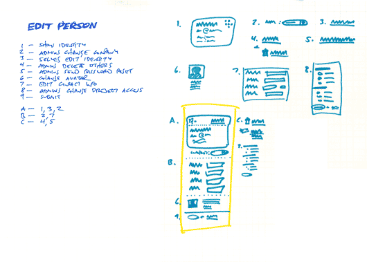
- List all the things a screen should do. What should the customer be able to accomplish? What information are you sure should be displayed? Which affordances are necessary for customers to start a process or reach a goal? Label these things with numbers.
- Look for any numbered items that relate to each other, conceptually or spatially. Label these groups of numbers with a letter.
- Sketch a design (or multiple designs) for each number or letter group.
- Combine the individually sketched blocks into a unified design. Let the pieces fall together into a whole.
<p>And don’t forget, the next step isn’t a polished wireframe. It’s code you can click on!</p><div>


